You may be getting good traffic on your Shopify store, but if users are not adding products to their cart, something is not working. This is a common challenge for many brands. Visitors are landing on your product pages, exploring for a few seconds, and leaving without taking action.
The issue is not always your marketing. In most cases, it is your product page experience. This is where users decide whether they want to move forward or not.
Your product page is not just a place to display information. It is where customers evaluate your product, build trust, and make a decision. If that decision feels unclear or difficult, they leave.
To improve your add to cart rate, you need to understand what influences user decisions and how to remove hesitation at the right moment.
What Makes Users Add a Product to Cart
When a user lands on your product page, they are not just browsing. They are trying to make a quick decision. Within a few seconds, they start evaluating whether your product is worth their time and money.
At this stage, users are subconsciously looking for clear answers to a few important questions:
- Is this product right for me?
- Can I trust this brand?
- Is it worth the price?
- What happens if something goes wrong?
If your product page does not answer these questions clearly and early, users begin to hesitate. And in most cases, hesitation leads to drop-offs.
For example, if your product looks visually appealing but does not show real usage or customer reviews, users may not feel confident. If pricing, delivery timelines, or return policies are unclear, they may delay their decision or leave altogether.
This is why Shopify product page optimization is not about adding more content. It is about making the right information visible at the right moment.
You need to guide users through their decision without making them think too much. The easier it is for them to understand, trust, and evaluate your product, the more likely they are to click on “add to cart.”
When your product page removes confusion and builds confidence, you are not just improving experience, you are directly improving your conversions.
5 Key Elements of a High-Converting Product Page
To improve your add-to-cart rate, you need to view your product page as a decision-making experience, not just a layout of content. Every user who lands here is trying to evaluate your product quickly and decide whether to move forward.
Instead of treating the page as a single block, it helps to think in layers. Each layer supports a different part of the user’s decision, and when one is missing, hesitation starts to build.
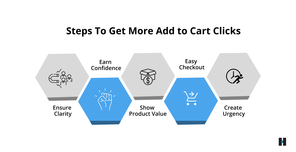
Clarity Layer
The first thing users look for is clarity. Within a few seconds, they should understand what your product is and whether it is relevant to them. If they have to scroll, read too much, or interpret vague information, they lose interest early.
A clear product title, a short summary, and strong visuals at the top can immediately answer three things: what the product is, who it is for, and what problem it solves. When this is obvious, users feel more confident continuing.
Confidence Layer
Once users understand the product, they start looking for reassurance. Even a small doubt can stop them from taking action.
This is where trust signals play a key role. Real customer reviews, ratings, and authentic product visuals help users feel that the product is reliable. For example, showing a strong rating close to the add-to-cart button can influence decisions instantly. The goal is to remove uncertainty before it turns into hesitation.
Value Layer
At this stage, users are trying to justify the price. They are asking themselves whether the product is worth it.
If your page only lists features, it may not be enough. You need to clearly explain how the product benefits them and what makes it a better choice. For instance, instead of simply mentioning premium material, explain how it improves comfort, durability, or everyday use. When users clearly see the outcome, the price feels more reasonable.
Ease Layer
Even when users are convinced, a complicated experience can slow them down or stop them completely. Small frictions, like confusing options or hard-to-find buttons, can lead to drop-offs.
Your product page should make the next step feel effortless. Keep selections simple, avoid unnecessary steps, and ensure the add to cart button is always easy to find. A clean and smooth experience helps users act without overthinking.
Urgency Layer
Sometimes users are ready but still delay their decision. This delay often results in lost conversions.
Adding a sense of urgency can encourage users to act immediately. Subtle cues like low stock messages or clear delivery timelines can create that push. For example, when users see limited availability, they are more likely to complete the action instead of postponing it.
When these layers come together, your product page starts guiding users naturally. Instead of forcing a decision, it removes confusion, builds trust, and makes taking action feel like the obvious next step.
Why Visually Good Product Pages Still Fail to Convert
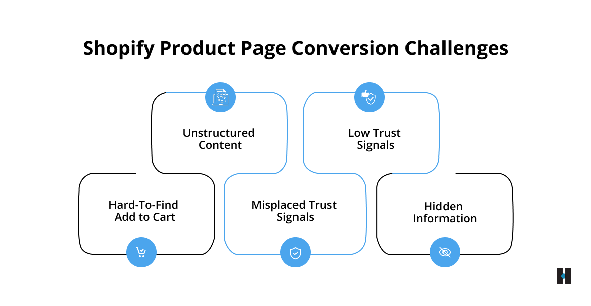
Many Shopify stores invest time in making their product pages look visually appealing, but conversions are not driven by design alone. The real issue often lies in how the page communicates information and supports user decisions.
In most cases, the gaps are not obvious. They are small but critical issues that create hesitation at the wrong moment.
Some of the most common problems include:
- Important details like pricing, delivery timelines, or key benefits are not visible early, forcing users to search for information
- Product descriptions focus more on features, but fail to explain how the product actually helps or improves the user’s experience
- The add to cart button exists, but it does not stand out enough to guide users toward action
- Trust signals, such as reviews, ratings, or return policies, are placed too low, missing the moment when users need reassurance
- Too much content is added without structure, which overwhelms users instead of helping them decide
For example, if delivery information or return policies are buried at the bottom of the page, many users may leave before they even find it. At that point, the decision is already lost.
When your product page does not guide users clearly and in the right order, it creates friction. Fixing these gaps is not about adding more content, but about making the right information visible at the right time. This is what helps improve your add to cart rate in a meaningful way.
How Smart Page Elements Boost Shopify Conversions
To improve your add to cart rate, your product page should not just present information; it should guide users step by step toward a decision. Every section of the page should answer a question or remove a doubt at the right moment.
It starts with a strong above-the-fold section, because this is where users form their first impression. If this part is unclear or weak, many users will leave without exploring further.
Your above-the-fold should clearly communicate:
- A product title that is easy to understand and benefit-driven
- High-quality images that show the product clearly and from multiple angles
- Visible pricing along with a key benefit or offer
- A prominent add to cart button that is easy to notice and access
Once users scroll, your page should continue supporting their decision instead of overwhelming them with information.
As they move down, you should guide them with:
- Descriptions that are simple, structured, and focused on real benefits rather than just features
- Visuals that show how the product is used in real-life situations
- Trust signals, such as reviews, ratings, or testimonials, are placed where users naturally look for reassurance
- Clear delivery timelines and return policies that remove uncertainty
For example, when users see how a product fits into everyday use, it becomes easier for them to imagine owning it. This reduces hesitation and builds confidence in their decision.
When your product page is structured in this way, each element works together to support the user. Instead of just browsing, users feel guided, informed, and ready to take action.
High-Converting Product Pages Begin with Mobile Optimization
Most users today browse and shop on their phones, which means your product page is often experienced on a smaller screen first. If your mobile experience is not smooth and intuitive, you are likely losing potential customers before they even consider adding a product to their cart.
Mobile users are more impatient and action-driven. Even small usability issues can break their flow and lead to drop-offs.
Some common problems that affect mobile performance include:
- Buttons that are too small or difficult to tap make interaction frustrating
- Slow-loading pages that cause users to leave before the content fully appears
- Long, cluttered layouts that require too much scrolling without a clear direction
- Add-to-cart buttons that are not visible when users are ready to take action
To improve your mobile experience, you need to focus on simplicity and accessibility.
You should:
- Use a sticky add-to-cart button so users can act at any point without scrolling back
- Keep your content clean, well-spaced, and easy to read on smaller screens
- Optimize images and elements to ensure faster loading speed
- Make sure your call to action is always clearly visible and easy to tap
When your mobile product page feels fast, clear, and effortless to use, users are more likely to stay engaged and complete the action. This directly impacts your Shopify add to cart rate and overall conversion performance.
If you are looking to identify what might be holding your mobile experience back, connecting with the team at tecHindustan will help you uncover gaps, implement practical improvements, and create a smoother path from browsing to action.
Behavioral Triggers That Increase Add to Cart Rate
User decisions on a product page are rarely random. They are shaped by small psychological cues that influence how confident and ready a user feels to take action. When used correctly, these signals can reduce hesitation and move users closer to adding a product to their cart.
Some of the most effective behavioral triggers include:
- Social proof: Showing reviews, ratings, or real customer feedback helps users feel reassured that others have already trusted and liked the product
- Scarcity: Messages like limited stock or low availability create a sense of urgency and encourage quicker decisions
- Risk reversal: Clear return policies, guarantees, or easy exchanges reduce the fear of making a wrong purchase
- Pricing cues: Discounts, savings highlights, or simple comparisons make the value of the product easier to understand
For example, placing a message like “Easy 7-day returns” close to the add-to-cart button can reduce purchase anxiety and make users feel more comfortable taking the next step.
When these triggers are used thoughtfully, they do not feel pushy. Instead, they support the user’s decision-making process and help turn interest into action.
How We Increased Shopify Conversions by Optimizing Add to Cart
To understand what actually improves the add to cart rate, it helps to look at how the right changes impact real user behavior. We worked with a Shopify brand that was generating consistent traffic, but the number of users adding products to cart was lower than expected.
The issue was not visibility or demand. Users were landing on product pages but not taking the next step. This clearly indicated a gap in how the product was being presented and perceived.
When we analyzed the product pages, we found that users were not getting enough clarity about the product, nor enough confidence to make a decision. The page had information, but it was not structured in a way that supported quick understanding or trust.
What We Improved
- Made product titles clearer and benefit-focused so users could instantly understand the value
- Added real-life product images and usage context to help users visualize the product in everyday scenarios
- Moved trust signals like reviews and ratings closer to the add-to-cart button for better visibility
- Simplified product descriptions to make them easier to scan and understand
- Improved the mobile experience with a cleaner layout and better CTA visibility
Each improvement was focused on reducing hesitation and making the decision process easier for the user.
What We Achieved
After implementing these changes, the brand saw a clear improvement in the add-to-cart rate. Users were able to understand the product faster and felt more confident while taking action.
This resulted in higher conversions from the same traffic, proving that optimizing the product page experience can unlock significant growth without increasing marketing spend.
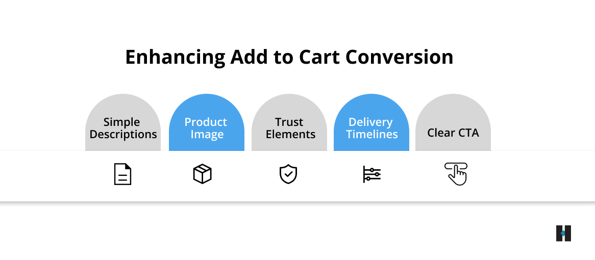
Simple Fixes That Boost Add to Cart Rate
Improving your add to cart rate does not always require major design changes. Often, small and practical improvements can remove friction and make it easier for users to take action at the right moment.
- The add to cart button should be clearly visible and easy to access, so users do not have to search for it or scroll unnecessarily.
- Delivery timelines placed early on the page help reduce uncertainty and give users more confidence before they move forward.
- Trust elements like secure checkout icons, return policies, or guarantees work best when placed close to the CTA, where decisions are made.
- The first product image should quickly communicate what the product is and how it is used, creating a strong and clear first impression.
- Product descriptions should be simple and easy to scan, helping users understand the value without feeling overwhelmed.
When combined, these small improvements create a smoother experience and help users move from browsing to action more quickly, leading to noticeable gains in your add-to-cart rate.
How Product Pages Are Evolving to Meet Modern Shopper Expectations
Product pages are evolving as technology advances and user expectations continue to grow. Users today expect faster loading, clearer information, and more personalized experiences before they decide to take action.
You will see more:
- Personalized experiences driven by user behaviour, past interactions, and browsing patterns, helping users see what is most relevant to them
- Interactive elements such as product previews, usage simulations, or guided selections that make it easier to understand the product
- Increased use of video content, including short demos and real-life usage, to communicate value quickly and effectively
- Cleaner, faster page designs that reduce clutter, improve readability, and ensure smooth performance across devices
As user expectations grow, your product page needs to adapt to these changes. Staying aligned with these trends will help you create better user experiences, improve engagement, and build a more future-ready Shopify store that consistently drives conversions.
Conclusion
Your product page is where users make the critical decision to buy. If they are not adding products to their cart, it usually means there are gaps in clarity, trust, or usability.
By improving product clarity, highlighting key benefits, and simplifying the user experience, you can remove friction and guide users toward action. Adding trust signals, real-life visuals, clear pricing, and visible delivery information reassures users and builds confidence. Optimizing for mobile and using smart behavioral triggers further increases the likelihood of conversion.
Even small changes, such as clearer CTAs, concise descriptions, or faster-loading images, can significantly boost your add to cart rate and overall Shopify performance.
If you are facing similar challenges, get in touch with the experts at tecHindustan to implement these solutions, optimize your product pages, and turn more visitors into loyal customers.