Are you unsure whether your landing page should be long or short? It makes sense to feel stuck. Today, user habits are shifting, design trends are evolving, and preferences aren’t what they used to be.
Some say short pages hold attention better. Others believe longer ones build trust and convert more. And with so many opinions floating around, it gets confusing to know what’s right for your page.
So, what actually works?
That’s what this blog is here to clear up. We’ll break down the difference between long and short landing pages, look at what really matters, like user intent and the kind of offer you’re sharing, and help you figure out what fits best for you.
Let’s dive into the details.
The True Purpose of a Landing Page
If you think of a landing page as just another web page, remember it really has one purpose, which is to guide someone toward taking action. It could be signing up, making a purchase, or booking a call. The entire page is built to guide them to that action without distractions.
A landing page is not meant to explain everything. It’s meant to speak to the right person at the right moment, clearly, simply, and with purpose.
A well-structured landing page with the right length can be the difference between a bounce and a conversion.
This page is not just about selling. It’s about helping someone make a confident decision. When done right, it builds trust, removes hesitation, and makes the next step feel natural.
Why Landing Page Length Matters More Than You Think
Understanding the importance of a landing page helps you see that getting the length right is key to making it work. A short landing page can leave people hanging; they might not get enough to feel sure or take the next step. But if it’s too long, they might scroll without any clear point, get distracted, or drop off midway.
The right length entirely depends on what you’re offering, who’s landing on the page, and what they need to know to feel ready. It’s not about cramming in more sections or stretching things out.
It’s about saying just enough to make someone feel clear and confident, without confusing them or making them second-guess. Because when the message is clear and the page feels right, people don’t just land, they move forward with trust.
What Makes a Short Landing Page More Effective
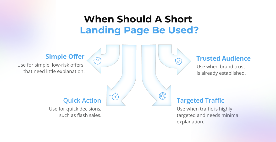
Not every landing page needs to be long. Sometimes, short and focused is precisely what works best, especially when the decision doesn’t need much convincing.
A short landing page works well when:
- The offer is simple and low-risk. If someone already knows what it is and what it does, they just need a clear way to say yes.
- Your audience already trusts you. Maybe they’re coming from an email or ad and don’t need a full explanation.
- You want to drive quick action. For flash sales, early access, or waitlists, less friction means faster decisions.
- The traffic is highly targeted. If people are landing with clear intent, you don’t need to over-explain.
Short landing pages work because they respect attention spans and don’t get in the way.
It’s not about skipping details. It’s about knowing your audience already has them and just needs the next step, right there in front of them.
When to Use a Long Landing Page
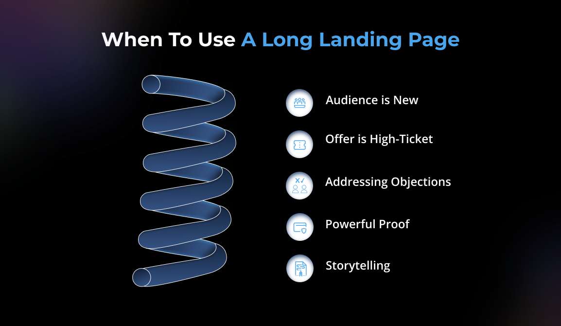
Sometimes, your offer needs a little more space to breathe, and that’s when a long landing page becomes more effective. It’s not about adding fluff. It’s about giving people the clarity, confidence, and answers they need before they take action.
A longer page works better when:
- Your audience is new to what you’re offering. They need context, education, and trust before they’re ready to move.
- The offer is high-ticket or high-commitment. People won’t just sign up or pay without understanding the value.
- You’re addressing objections. A longer page gives you space to handle doubts, fears, or confusion.
- You have powerful proof. Testimonials, case studies, stats, these need space, and they build trust.
- You’re walking someone through a story. Sometimes, storytelling creates the emotional connection that facts alone can’t.
A long landing page is not about writing more. It’s about giving people what they need, at their own pace.
Because when someone’s still deciding, every section is a step closer to “yes.” And when done right, a long page doesn’t feel long at all; it feels just right.
What to Say Depends on What You Sell
What you’re offering on the landing page makes all the difference. If you are asking for more time, money, and trust, people need to know more before they agree to it.
Think of it like this: You’re offering a quick, free resource, say, a 5-minute mindfulness guide on a wellness blog. Your page only needs the essentials: a headline that names the guide, a short line on how it helps, a few bullet points of what’s inside, and a simple sign-up form. People can understand the value in seconds.
But if you’re offering something bigger, like a paid 6-week coaching program, you’ll need to walk people through the whole picture. That could include an introduction to who you are, the problems you help solve, what each week of the program looks like, client testimonials, a clear breakdown of benefits, and answers to the questions they might not even know to ask.
And if it’s something deeply personal, like a one-on-one therapy session, you may need to go further, sharing your story, your approach, and the kind of results people have experienced. Here, the details aren’t just information; they’re reassurance.
The offer decides what belongs on the page. All you’re doing is giving people enough to feel ready, without adding anything they don’t need.
Why Understanding User Intent Is Key to Writing Better Landing Pages
The content you put on your landing page comes down to why people are visiting it in the first place. When you understand what they’re looking for, your message becomes much easier to shape and connect.
Here’s how the user intent impacts the content on the landing page:
- Curiosity-Driven Scanning
User Intent: Low-commitment, curiosity-driven scanning
At this stage, the user has arrived with minimal intent, driven more by curiosity than purpose. Their engagement is superficial: a glance at the headline, a brief look at the imagery, a few seconds of scrolling. They are not yet evaluating; they’re simply open to being intrigued.
Objective:
Deliver immediate clarity and visual resonance. A concise, benefit-oriented headline, a clear value proposition, and one or two compelling visual cues can establish enough relevance to prevent premature exits.
- Seeking Clarity and Evaluation
User Intent: Active comparison and decision support
Here, the user transitions from casual interest to active evaluation. They begin to read more attentively, explore interactive elements, and often compare your offering with alternatives in parallel tabs. Their internal dialogue becomes more focused: “Why should I choose this over another option?”
Objective:
Support their analysis with specific, evidence-backed content. Incorporate data points, side-by-side comparisons, validated case studies, and authentic testimonials to build credibility. At this stage, content must do more than inform—it must persuade through relevance and proof.
- Pre-Conversion Assurance
User Intent: High, seeking final reassurance before commitment
The user is nearing a decision but remains cautious. They revisit sections, interact with CTAs, and look for signals of trust and ease. Their behavior reflects a need for final validation, eliminating ambiguity before taking action.
Objective:
Eliminate friction. Ensure transparency around pricing, surface a clear and concise CTA, preempt objections through microcopy (FAQs, tooltips, inline guidance), and add affirming language that reinforces their choice. Your goal is to convert consideration into confident action.
How Trends Are Reshaping the Ideal Page Length
- Short pages work better for fast decisions
With a shorter attention span and people scrolling faster than ever, short and sharp landing pages are seeing higher conversions, especially when the ask is small. A free trial, a newsletter, a lead magnet, people don’t want to read paragraphs to get something simple. They just want to know what it is and what’s in it for them.
- Longer pages perform well in building trust
Having shorter pages doesn’t mean that long pages are no longer required. When your offer is asking for someone’s time, money, or commitment, they still want the full picture. Real stories, clear benefits, answers to their doubts, and all of this still matter. A longer page gives you space to do that, if used well.
- People want pages that speak, not sell to them
People landing on your page can tell when something’s just filled with fluff. Today, what’s working is honesty, real language, and true intent. Landing pages that meet people where they are, and help them make the next step, without pressure.
So, the trend is simple: say what needs to be said. Nothing more or less.
How to Choose the Right Length for Your Page
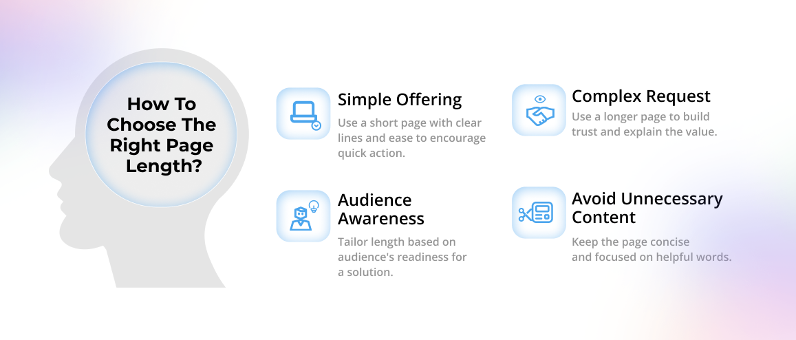
Choosing the right length for your landing page does not come with a fixed rule. It all depends on what you are offering and how you are trying to reach your audience.
Here are some of the key steps to help you choose the right length for your page:
- On your landing page, what you’re giving or asking for sets the tone. If it’s something simple, like a free download or a quick sign-up, you don’t need much. A few clear lines, a sense of ease, and you’re good. When there’s little to no risk, people don’t need to be convinced; they just need to feel comfortable.
- But if you’re asking for more, like a payment, a commitment, or personal details, take the space to meet them where they are. Show them what they’re stepping into, why it matters, and how it fits into their life. Trust builds slowly, and your words can help make that easier.
- Notice how your audience might be feeling. Are they actively looking for a solution, or just beginning to explore? If they’re sure, keep it focused. If they’re still finding their way, give them a little more grounding.
- Don’t stretch the page just to fit a design trend or check a box. Trim what’s extra. Keep what’s kind. The right words are the ones that help.
Let your landing page feel less like a script and more like a calm moment with someone who understands. Not to sell, but to share. And maybe that’s what makes it truly work.
What to Avoid When Setting Your Landing Page Length
You cannot just get the right landing page with some exact formula. But there are small mistakes that quietly get in the way, and most of them come down to why you shaped the page the way you did.
Here are a few gentle things to keep in mind:
- Writing too much just to sound clever
If the page is packed with jargon or stretched-out explanations, it can start to feel heavy. People don’t need every detail; they need the right ones. Keep what helps, and let the rest go.
- Keeping your page too short
If you’re offering something meaningful, something paid, personal, or bold, people need space to feel safe. Skipping over the story can make the ask feel too sudden.
- Guessing instead of knowing
If they’re already aware of the problem, don’t spend time laying it out again. Speak to where they actually are, not where you think they are.
- Letting the message get lost:
When things are hard to read, people leave. Keep the flow easy. Use breathing space, short lines, clear breaks, and a rhythm that feels light.
- Trying to impress rather than connecting:
A landing page isn’t a performance. It’s a chance to be real. Show up with care. Let the message land gently.
In the end, it’s not about the length. It’s about the feeling. Keep it honest. Keep it clear. Let people move forward with ease.
Final Words on Choosing the Right Landing Page Length
There’s no magic number when it comes to landing page length. What works for one brand or product might not work for another. The key is to focus less on “how long should it be?” and more on “what does someone need to know before they say yes?”
Sometimes that’s just a few lines. Sometimes it’s a few scrolls. And both are okay, as long as every word is doing its job. Just stay honest, helpful, and clear. If your page feels like a real conversation, not a lecture or a pitch, you’re already on the right track.
And if you’re still stuck on how long your landing page should be, or how to say what you need to say without saying too much, tecHindustan can help you figure that out. We’ve helped brands simplify complex offers, shape better messaging, and turn vague ideas into pages that actually convert. Just reach out, we’d love to make that easier for you.